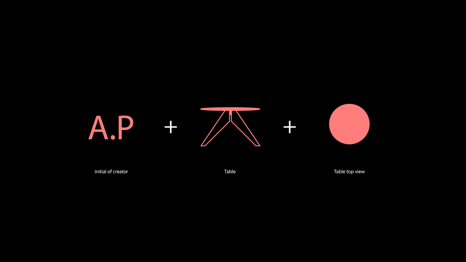
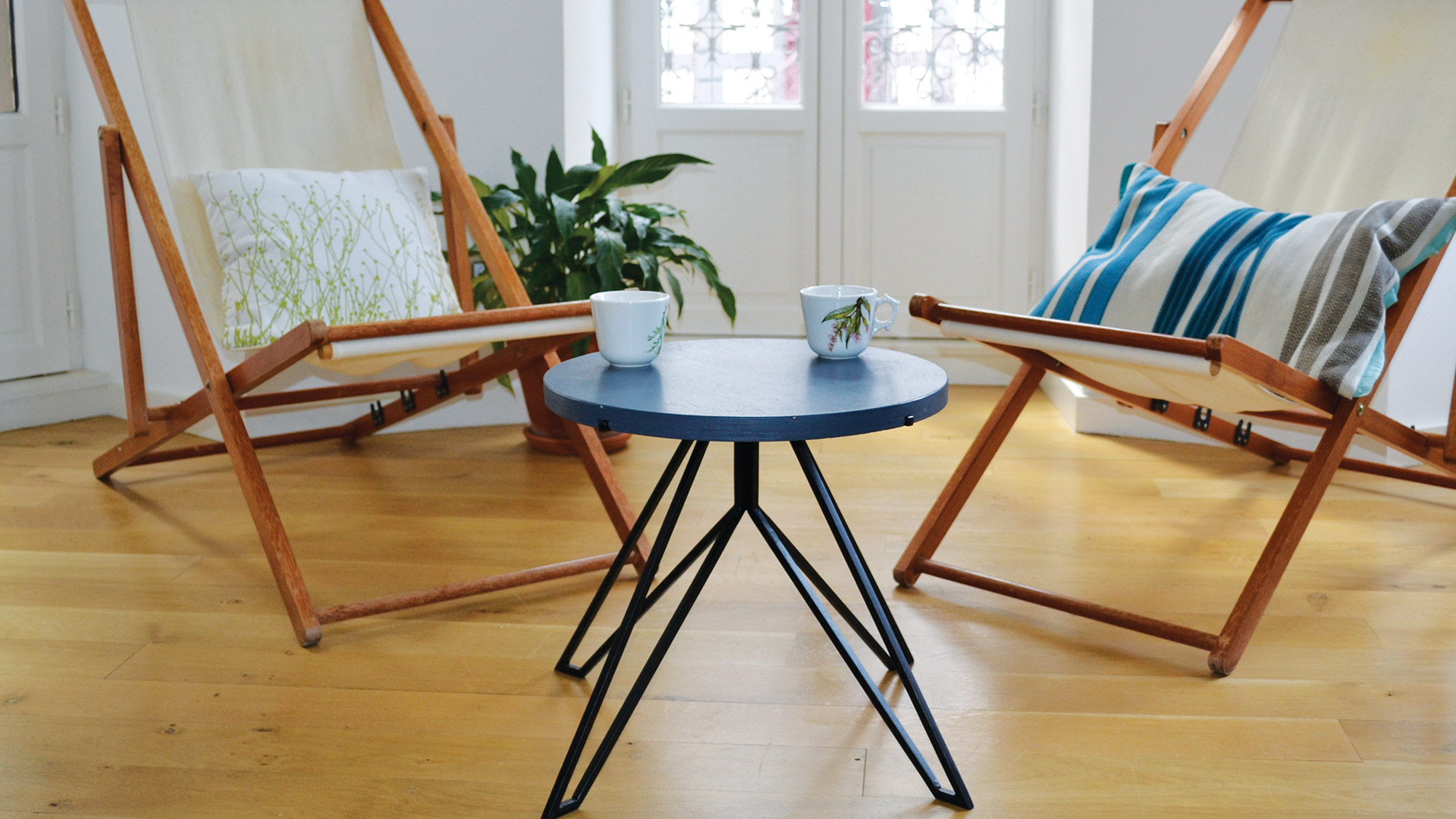
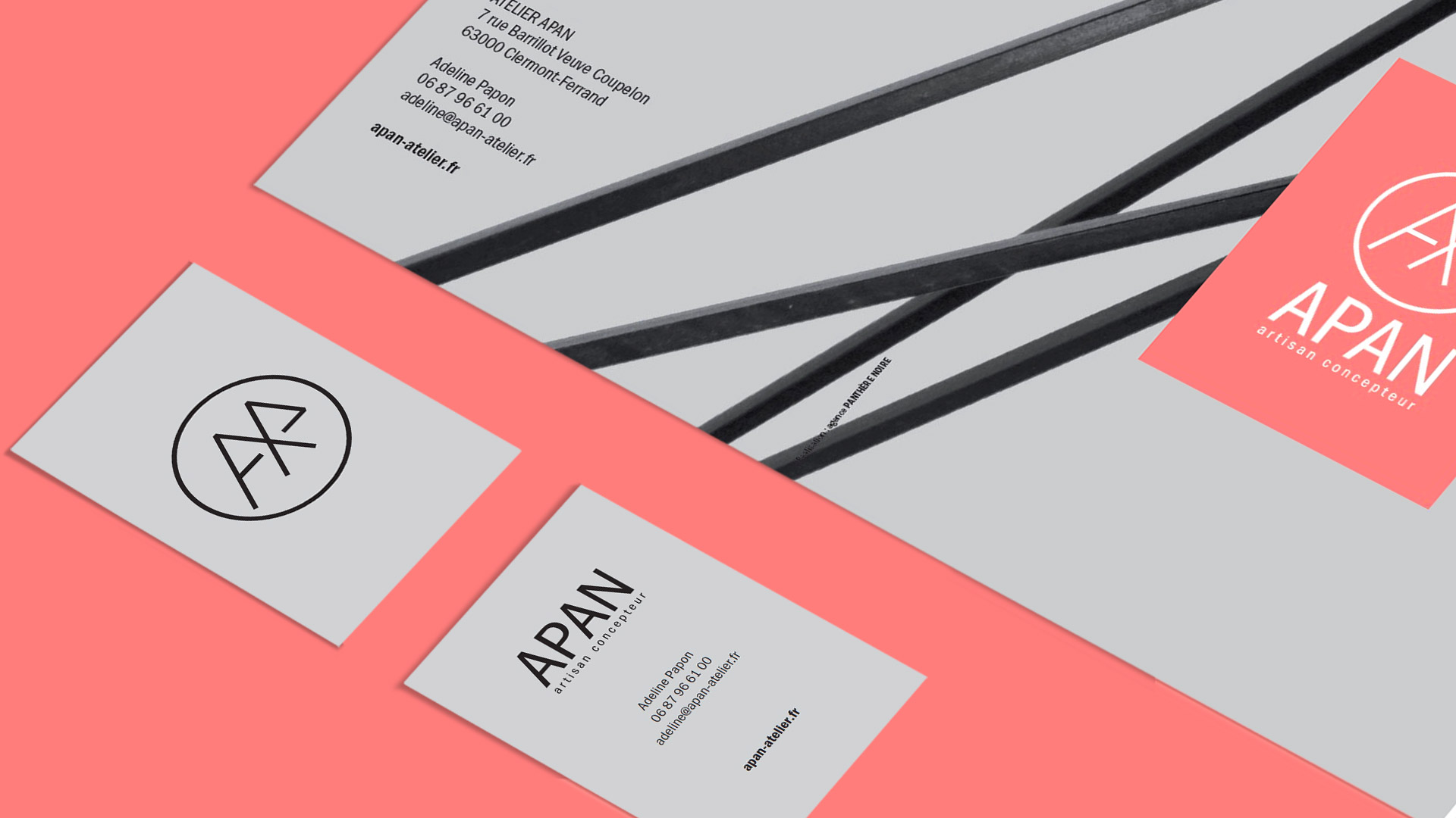
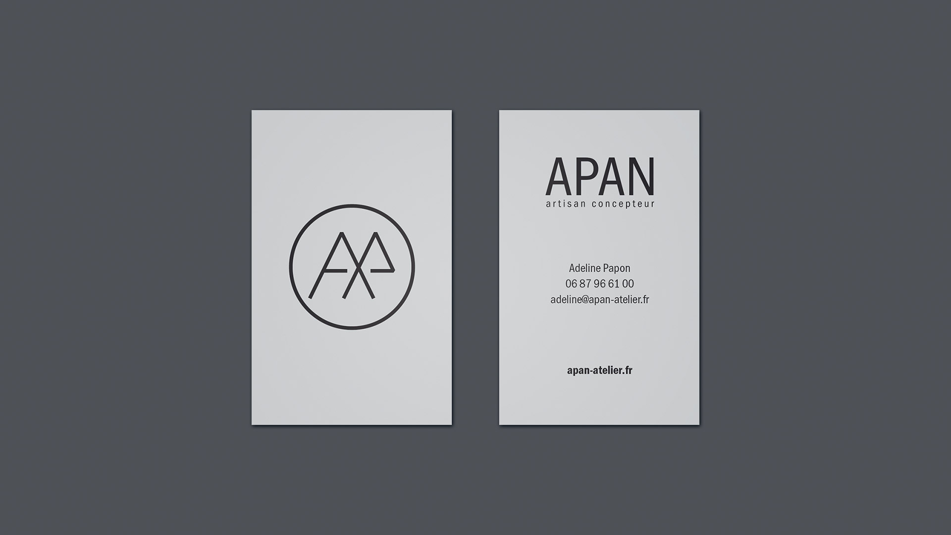
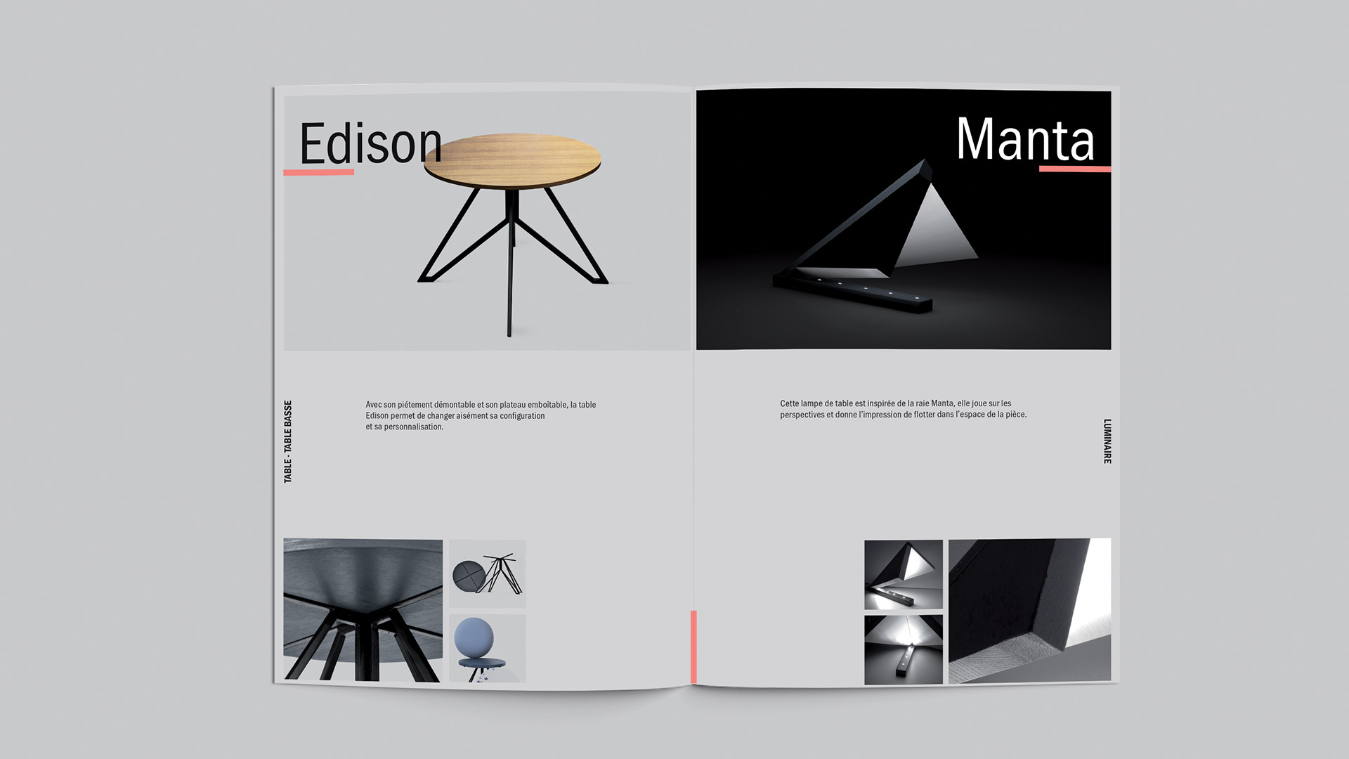
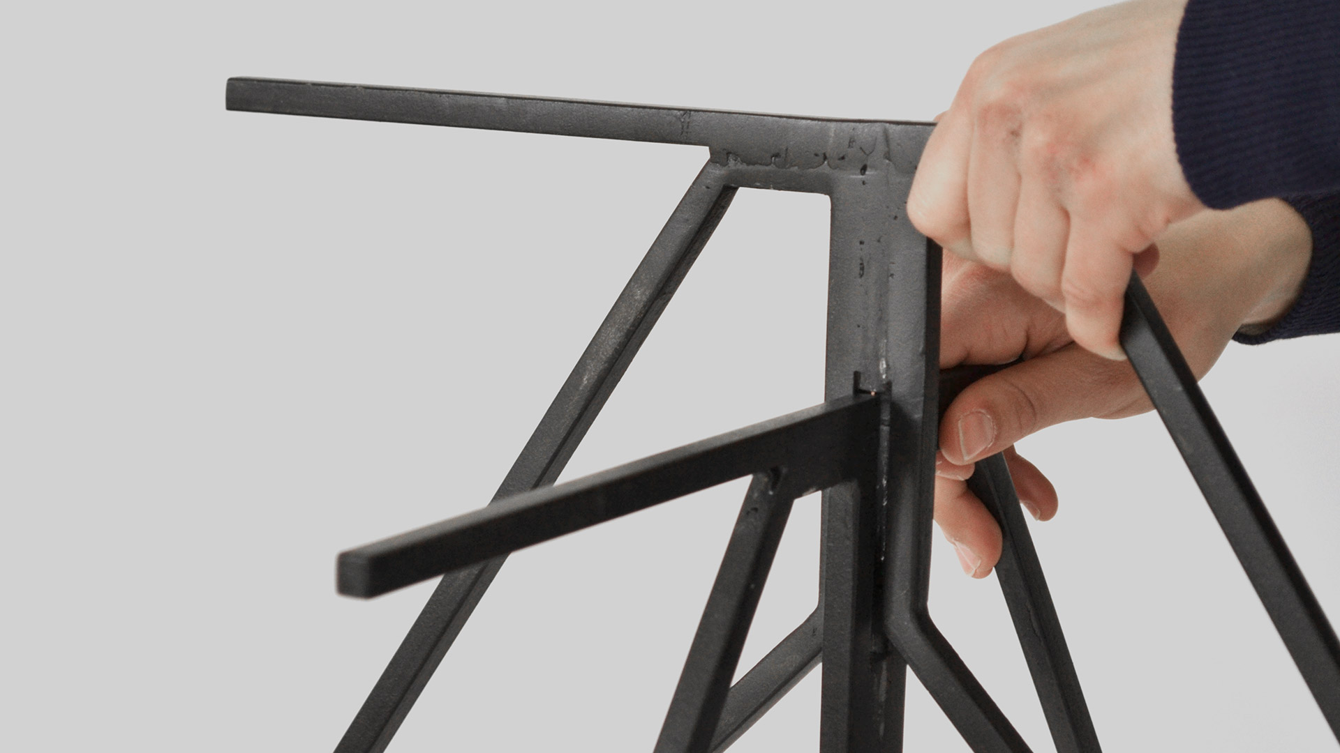
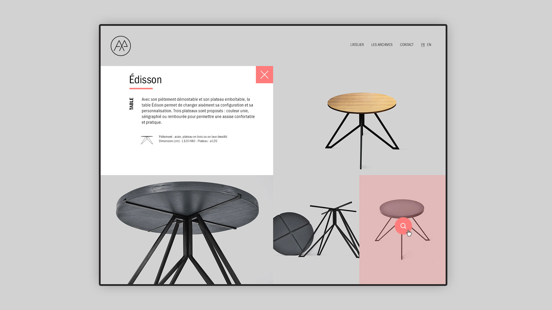
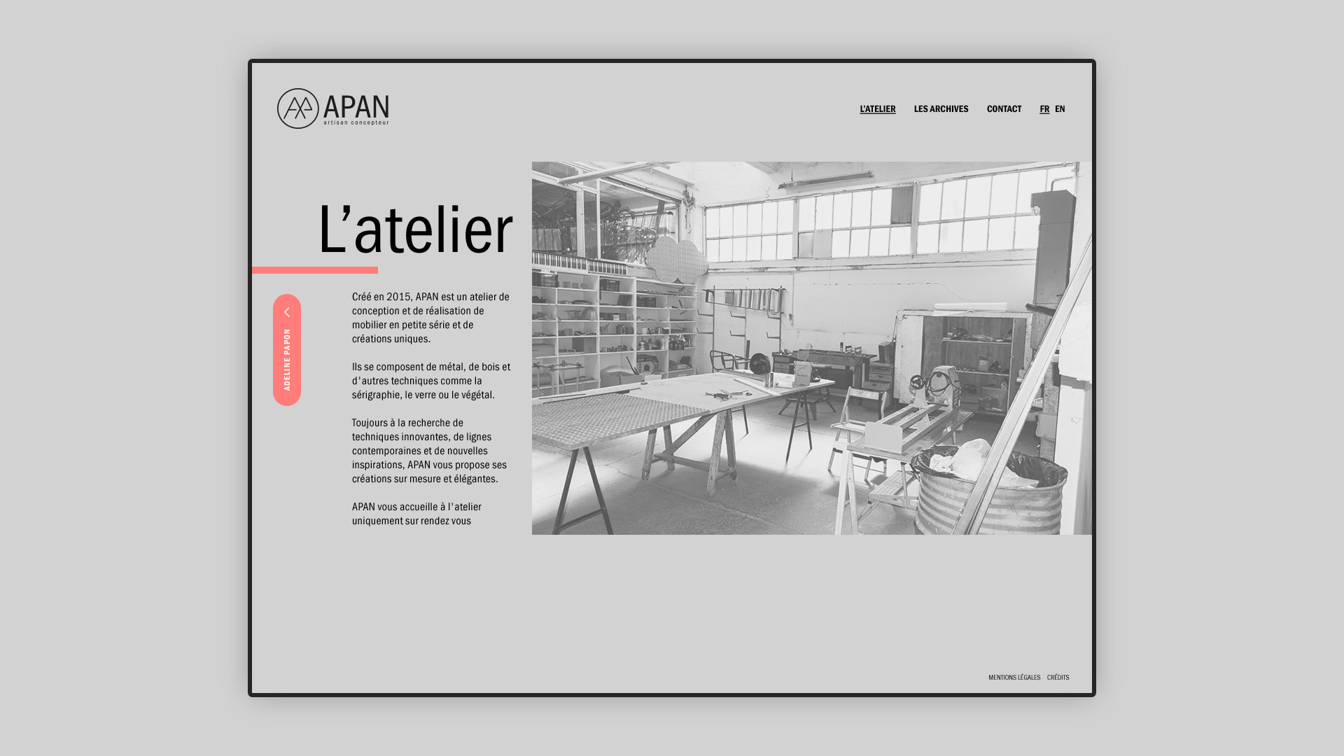
When the artist came to see me for this project, the name APAN already existed but no visual identity was associated with it. the letter A and P are the initials of the designer. To create this identity, I started by looking at all of the artist's creations (tables, stool, lamp, ...) they were mainly in steel and wood. But what struck me the most it is that we often find crossings of lines in the artist's creations. The artist's flagship object is a round table with steel legs.
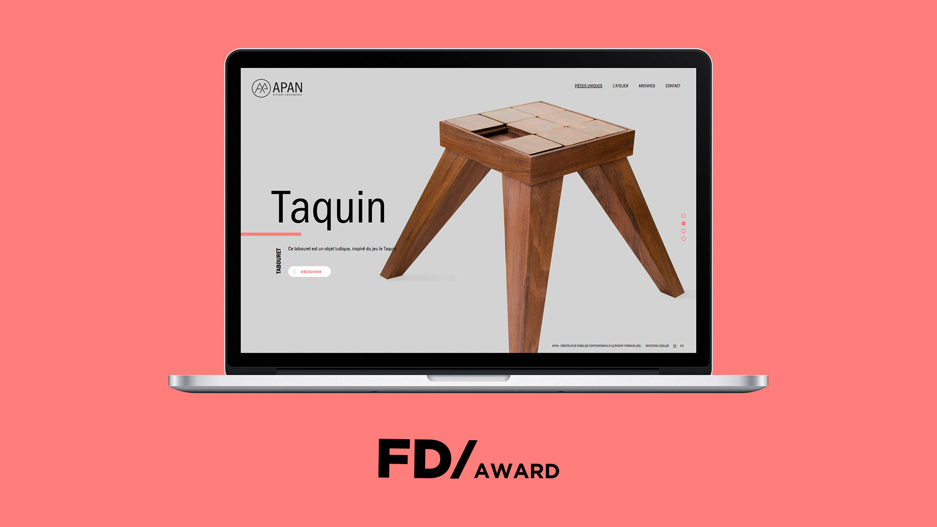
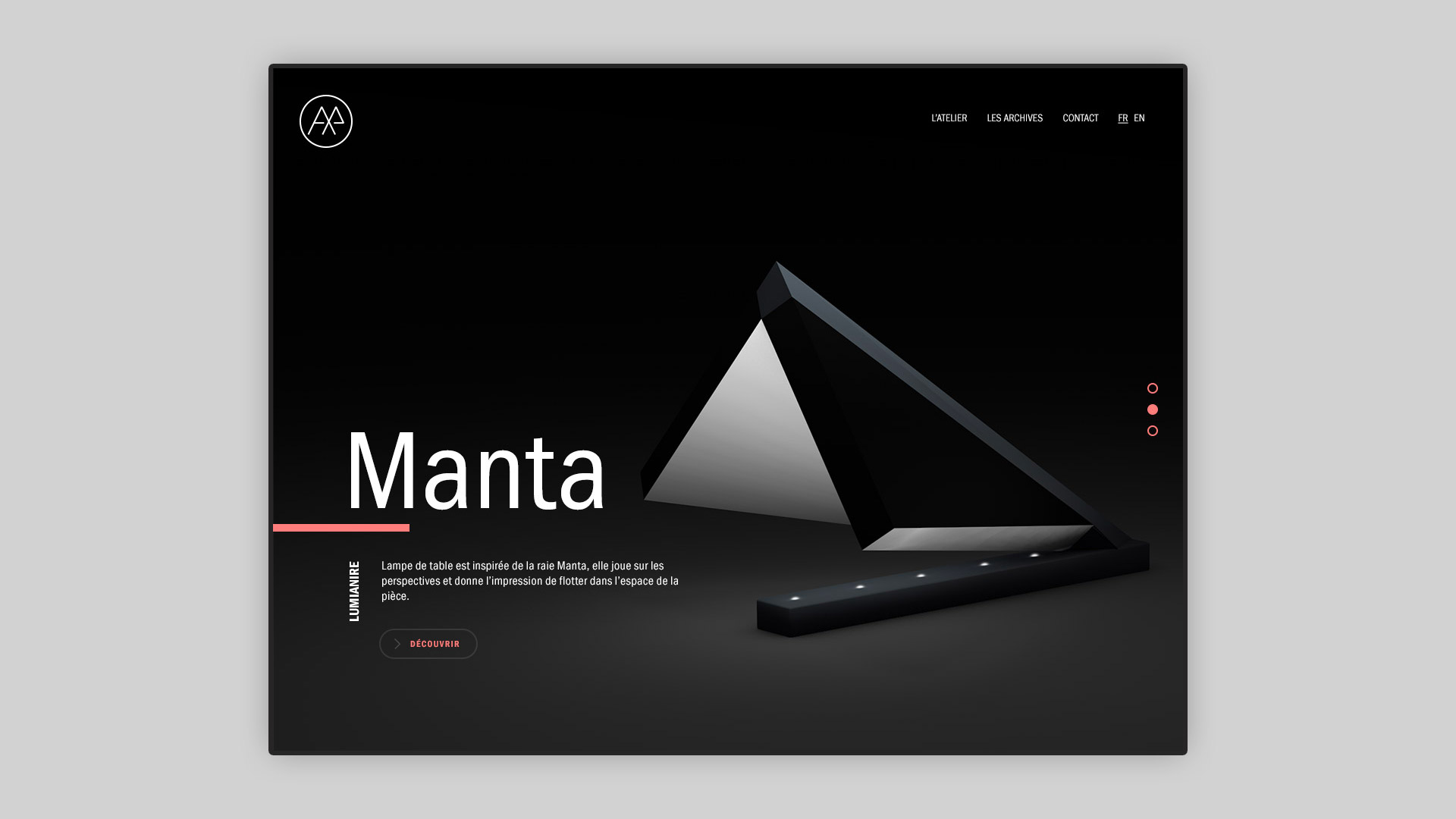
I decided to take inspiration from it to design the logo, representing the round table seen from below, revealing the crisscrossed steel legs (AP). Symmetry is an important part of the artist's original pieces. I also set up his website which got a Design Awards.
